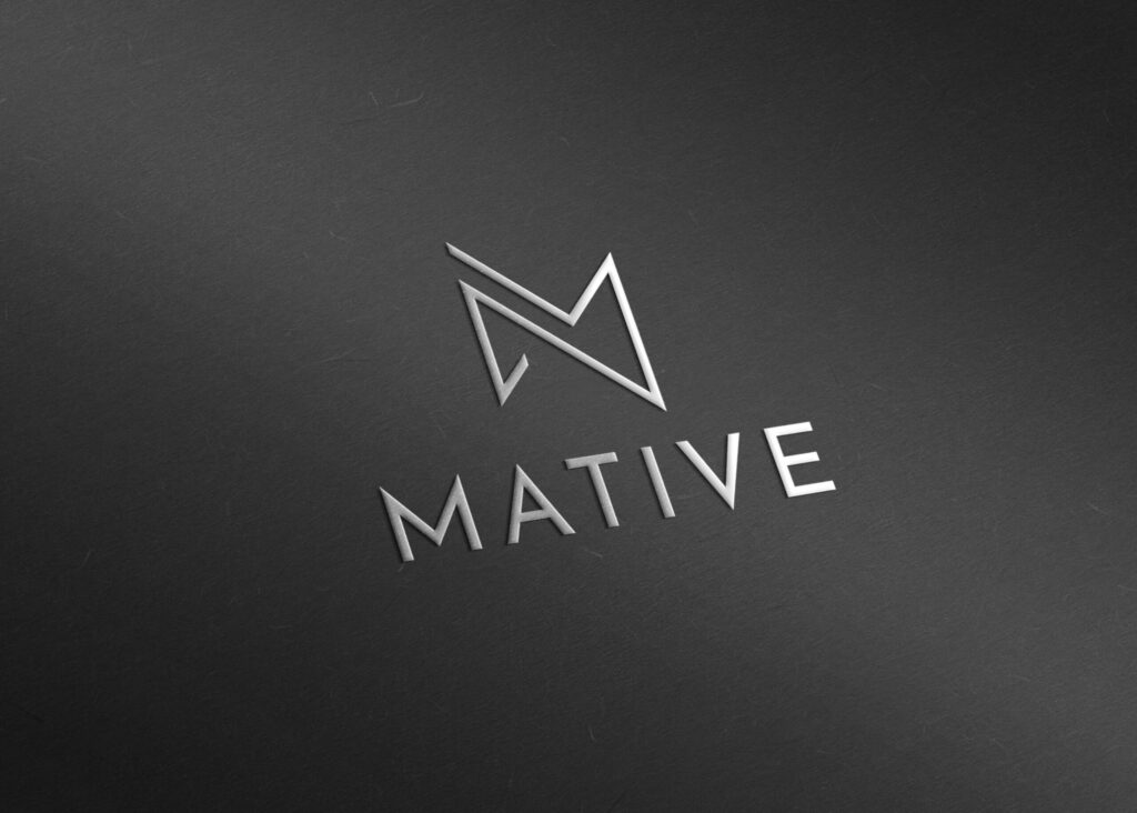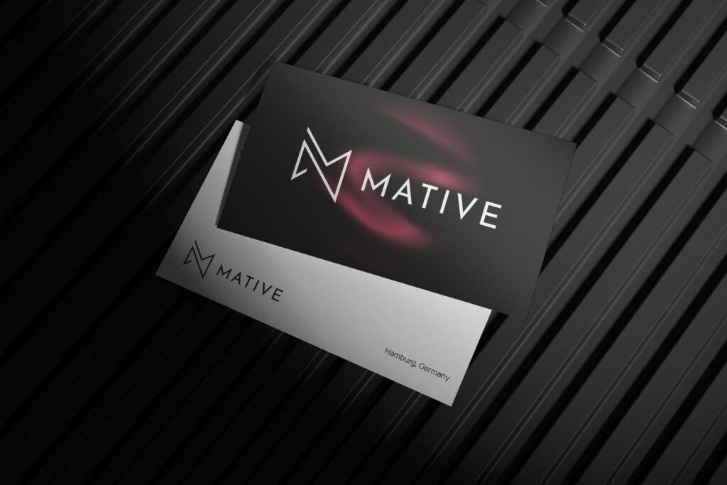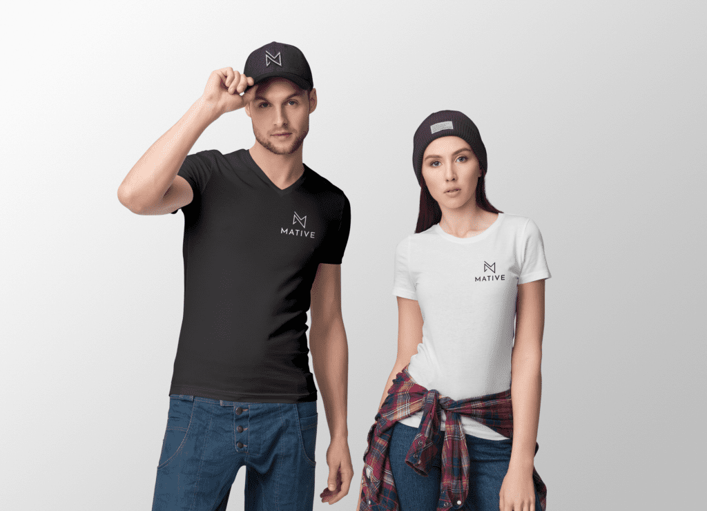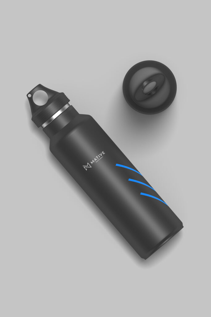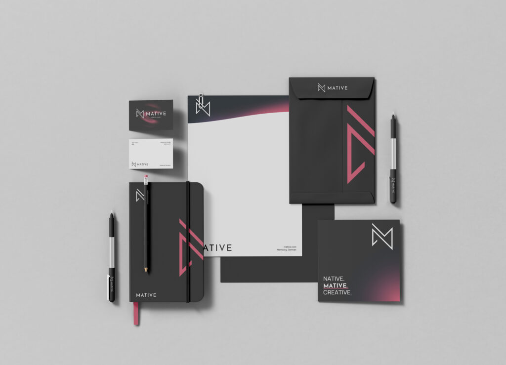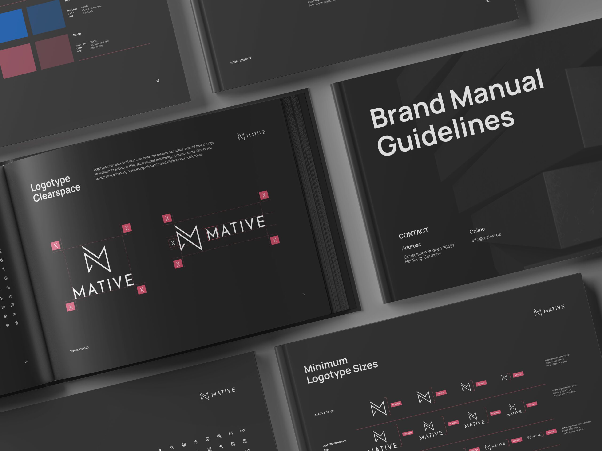
For this engagement, I led a ground‑up rebranding of Mative, transforming it from a regional studio into a standout, cohesive brand. After a deep‑dive audit of their existing identity and market positioning, I developed a refreshed visual system: a bespoke logo marked by clean geometry, a vibrant yet professional colour palette (teal accents paired with charcoal greys), and a unified typographic hierarchy (a blend of the contemporary sans‑serif “Circular” for headlines and the highly legible “Roboto” for body copy). These core elements formed the basis for a full suite of marketing collateral—business cards, pitch decks, social‑media templates, and environmental graphics—each crafted to maintain consistency and flexibility across both print and digital touchpoints.
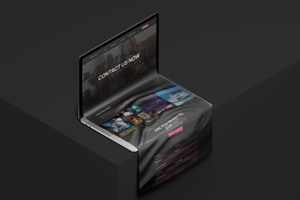
On the digital front, I designed and built a responsive one‑page website using Figma for prototyping and Webflow for development. The site employs intuitive UX patterns—sticky navigation, subtle scroll‑triggered animations, and modular CMS‑driven content blocks—to showcase Mative’s portfolio and service offerings. Interactions are enriched with Lottie‑driven micro‑animations, while performance is optimized through image compression and custom SVG icons. The result is a polished, scalable brand ecosystem that not only elevates Mative’s market presence but also provides a solid foundation for future growth.
