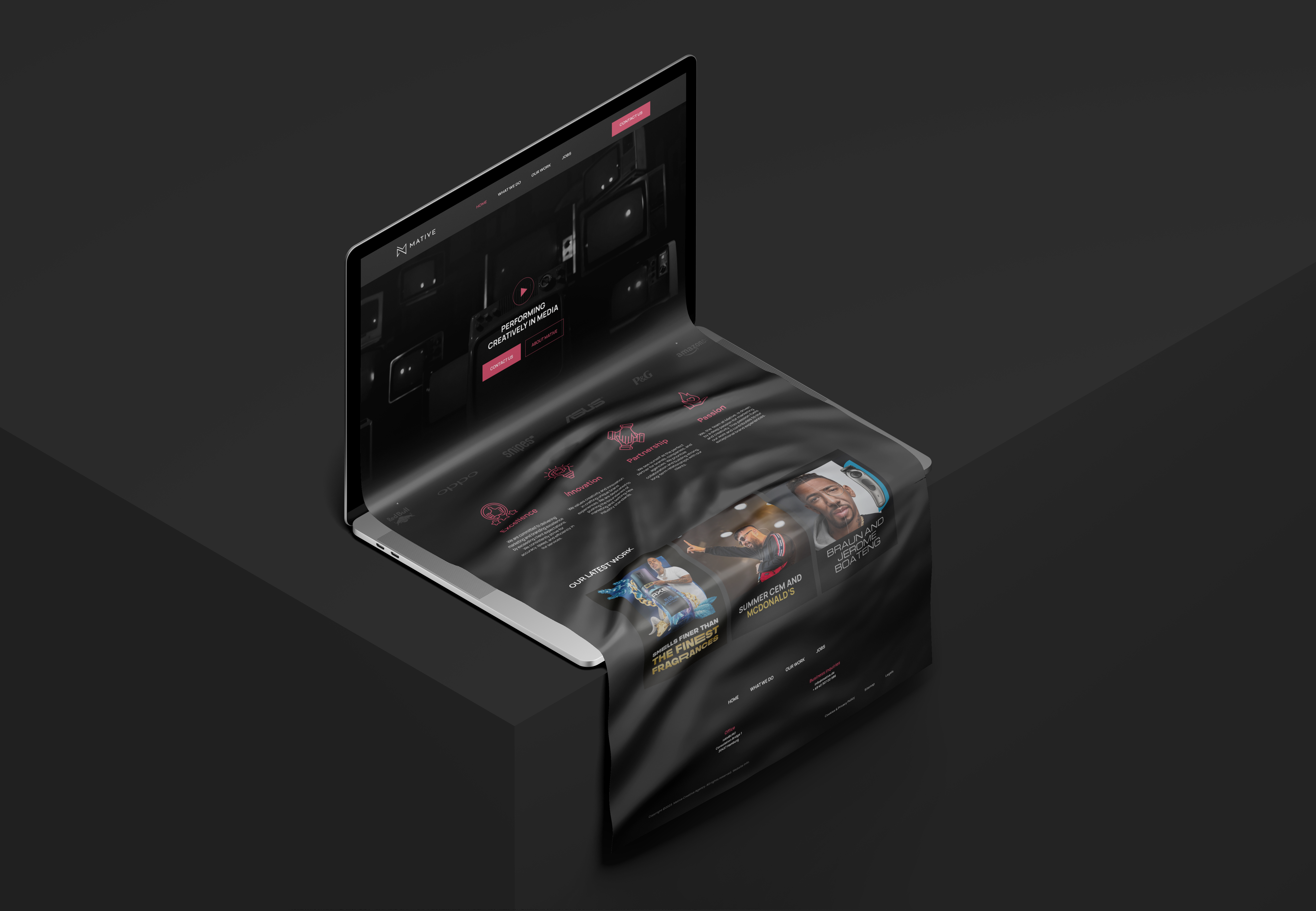
Professional. Efficient. Innovative. Drawing inspiration from their core values for marketing, communication, and creativity, we’ve woven these elements into Mative’s brand identity. Learn more about how we’ve seamlessly merged Mative’s vision with our design expertise to revamp their online presence and brand identity.
Branding for Mative
Product Visualization, Branding, Website Design
Art Direction
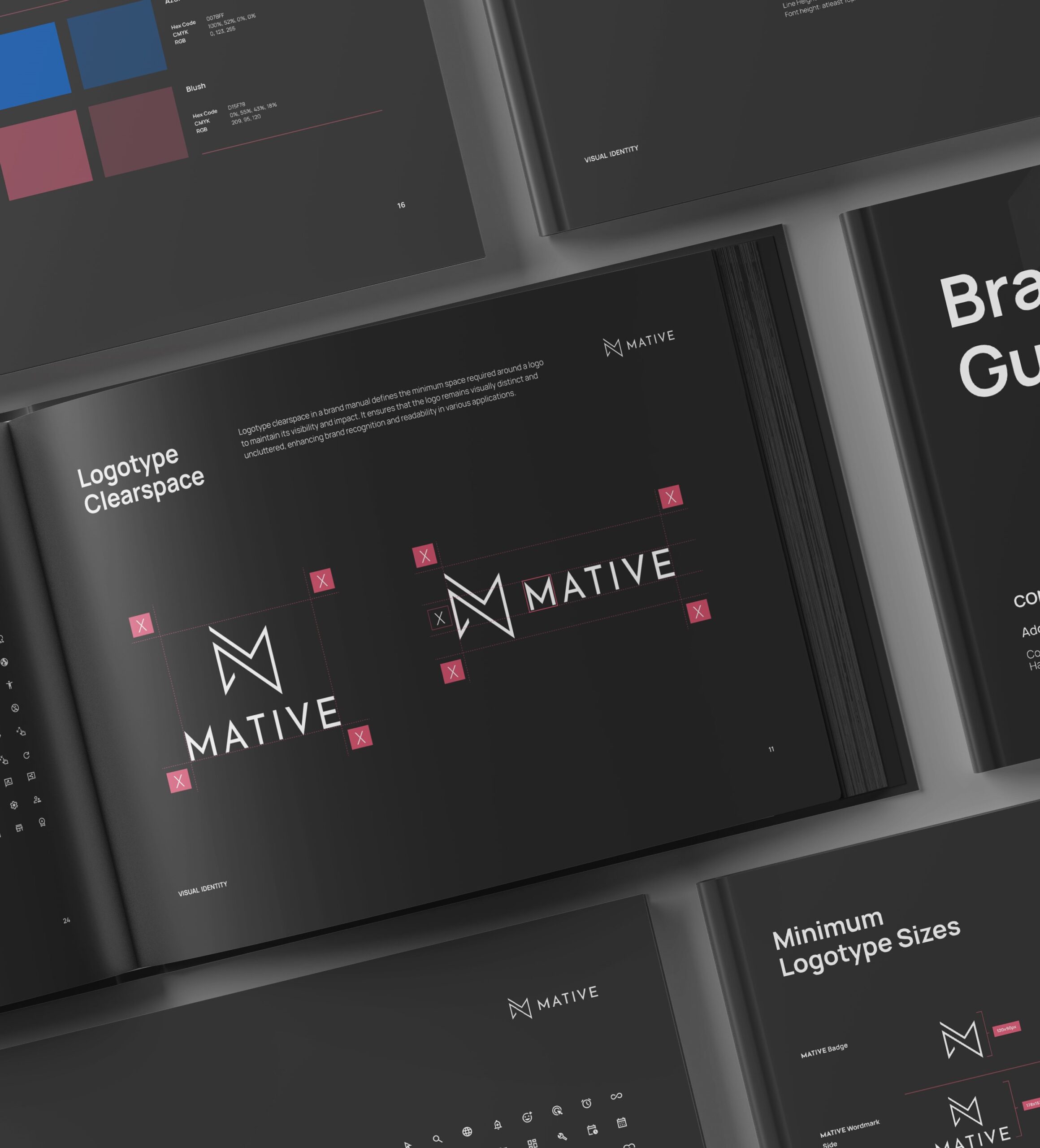
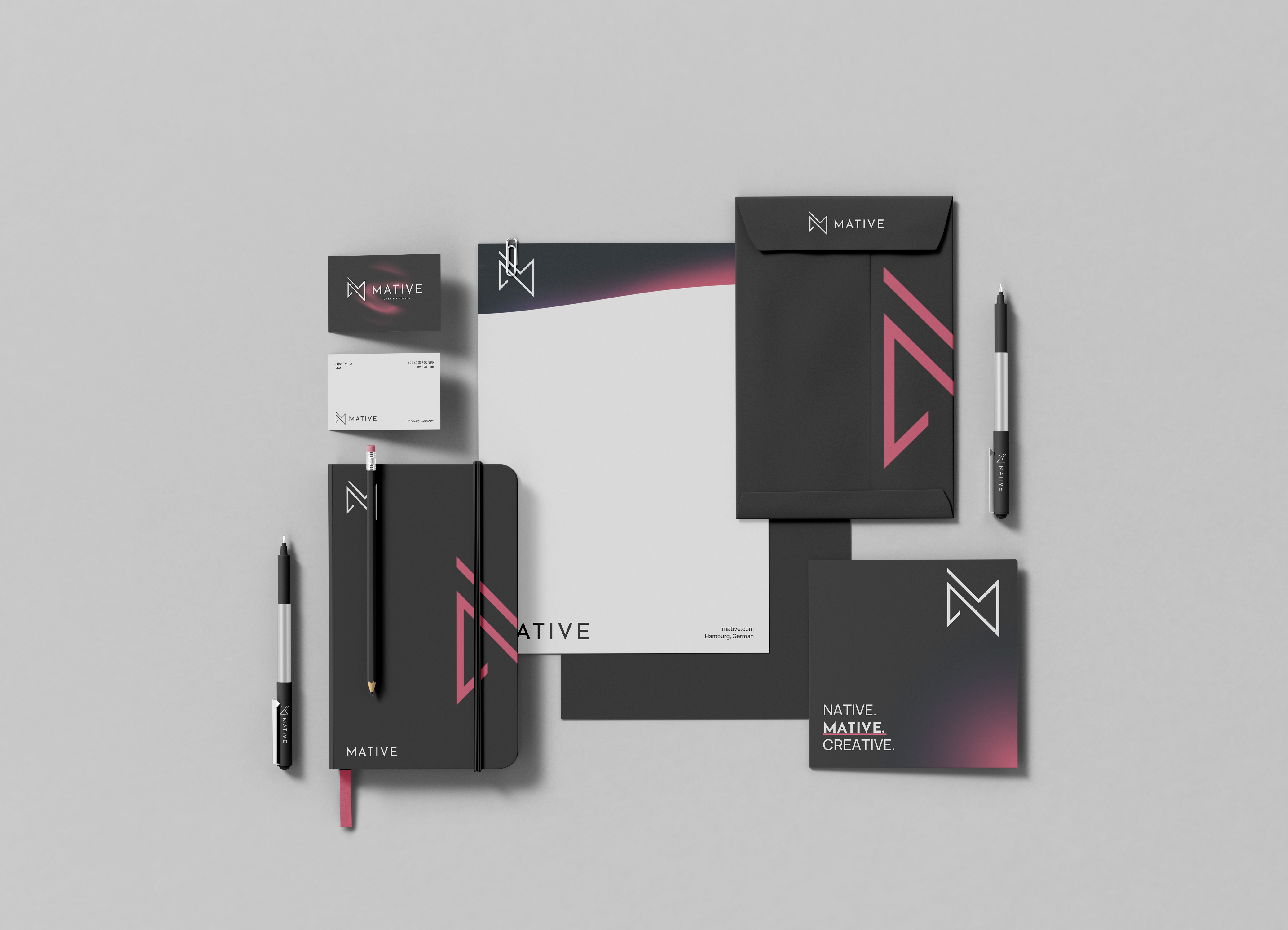
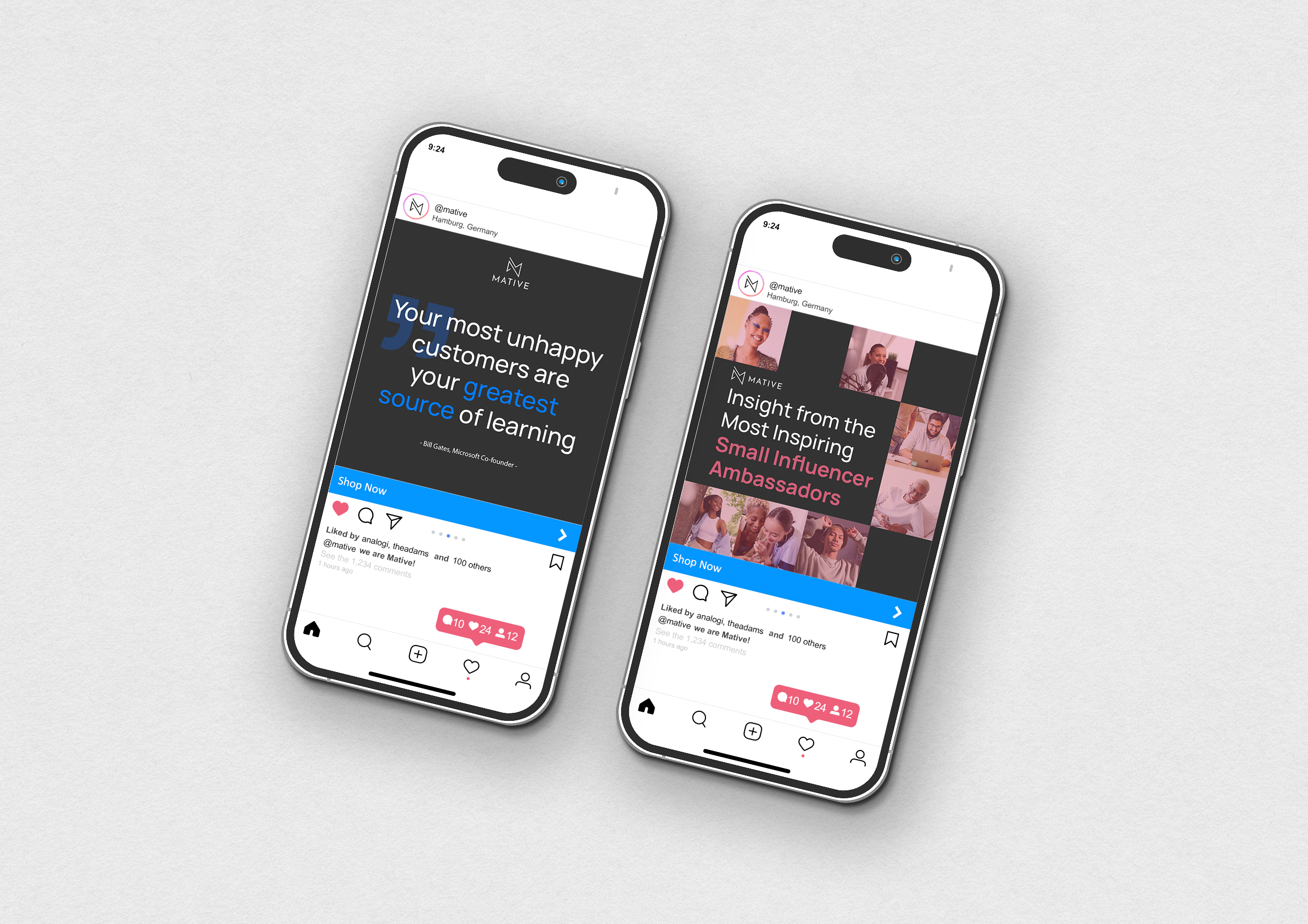
We executed the art direction by aligning it closely with MATIVE‘s core values. The use of modern, dynamic imagery and the incorporation of the chosen color palette, including Azure Blue and Red Blush, reflect Mative’s commitment to innovation and creativity. The art direction complements their brand identity, creating a seamless and professional visual representation that embodies their values.
Branding
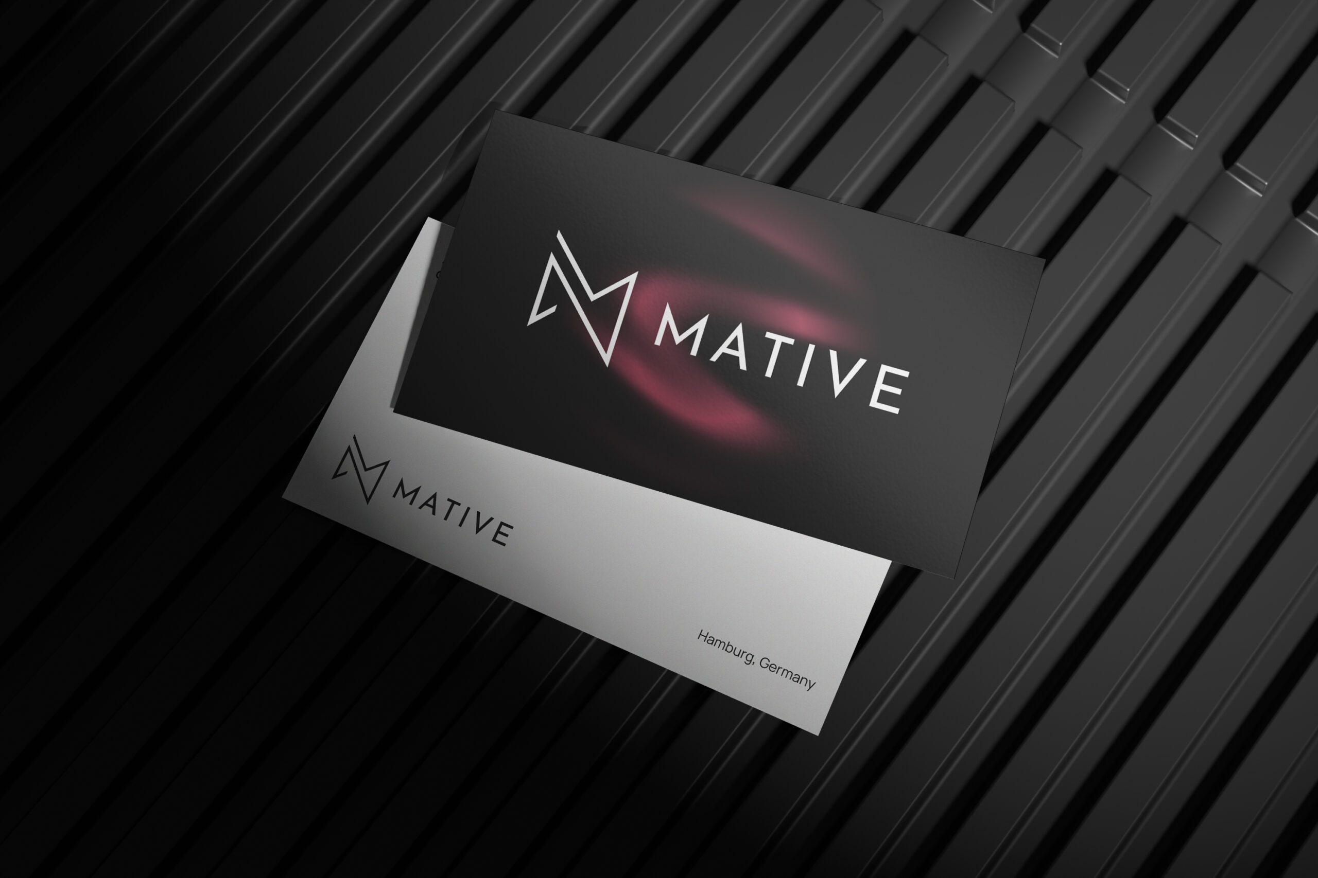
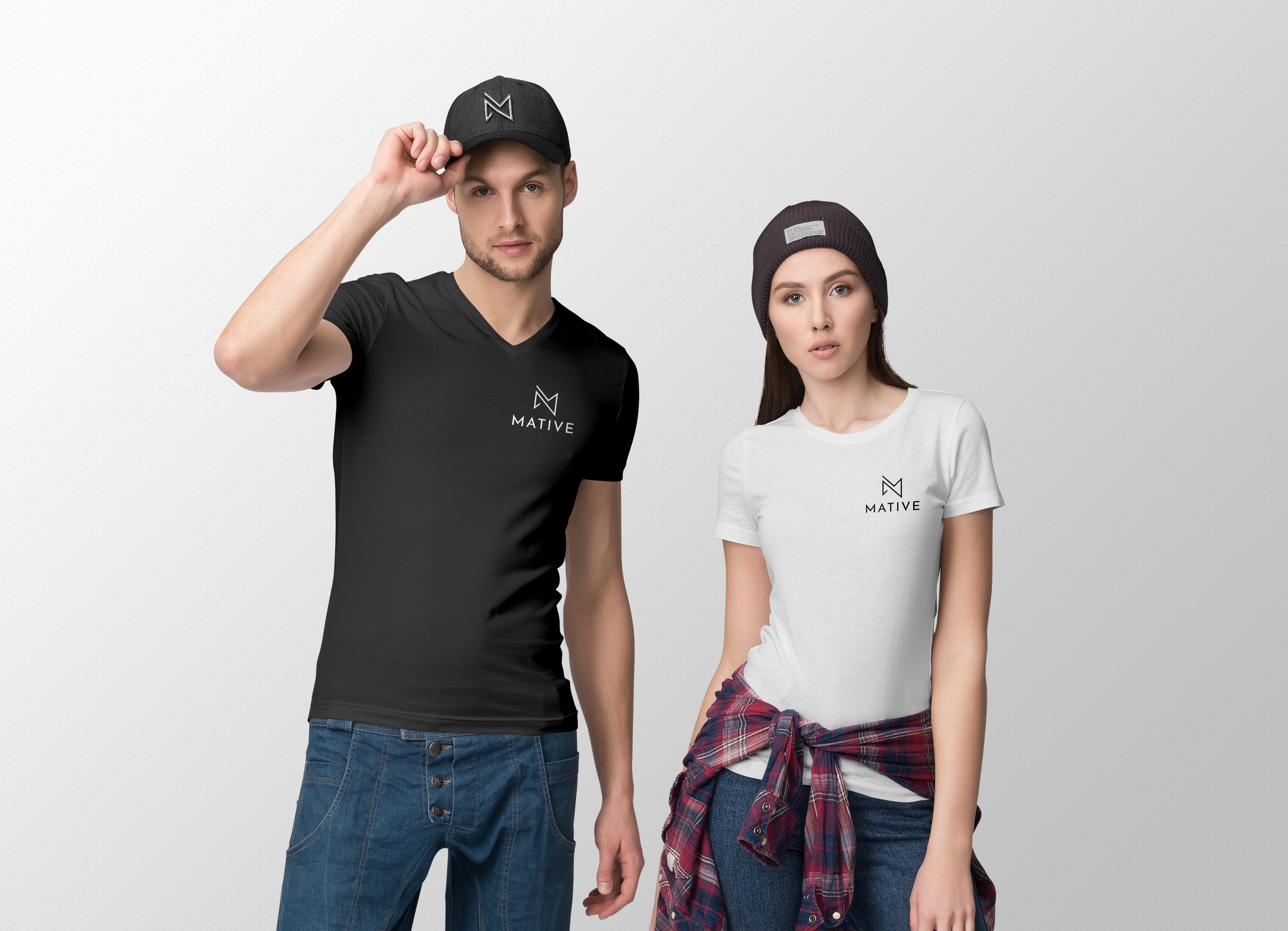
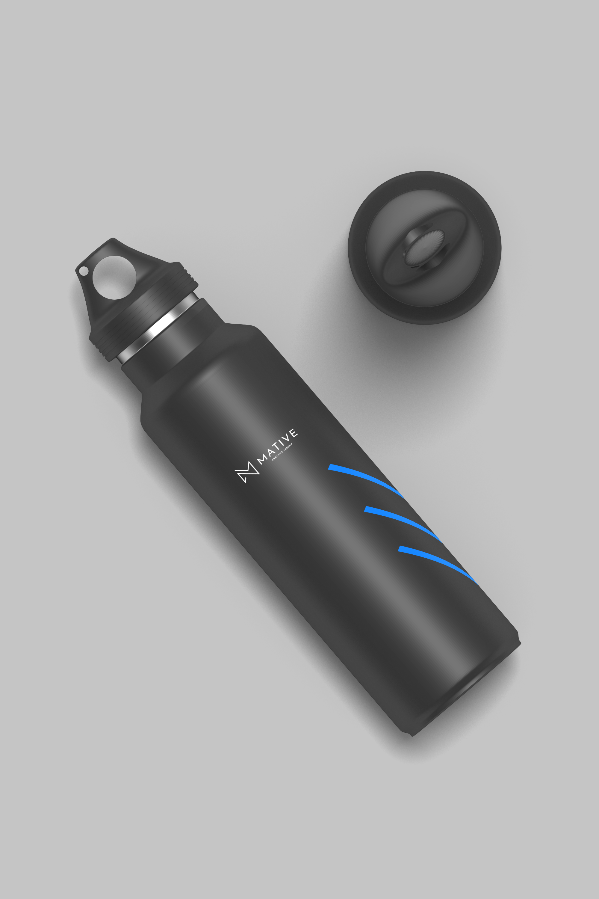
We completely reimagined MATIVE‘s branding by designing a dynamic logo that symbolizes creativity and streamlined innovation. Our thoughtfully selected brand colors, including Azure Blue and Red Blush, reinforce their commitment to excellence and energy. Through cohesive imagery, we brought their brand to life, creating a modern and engaging visual identity that captures their core values.
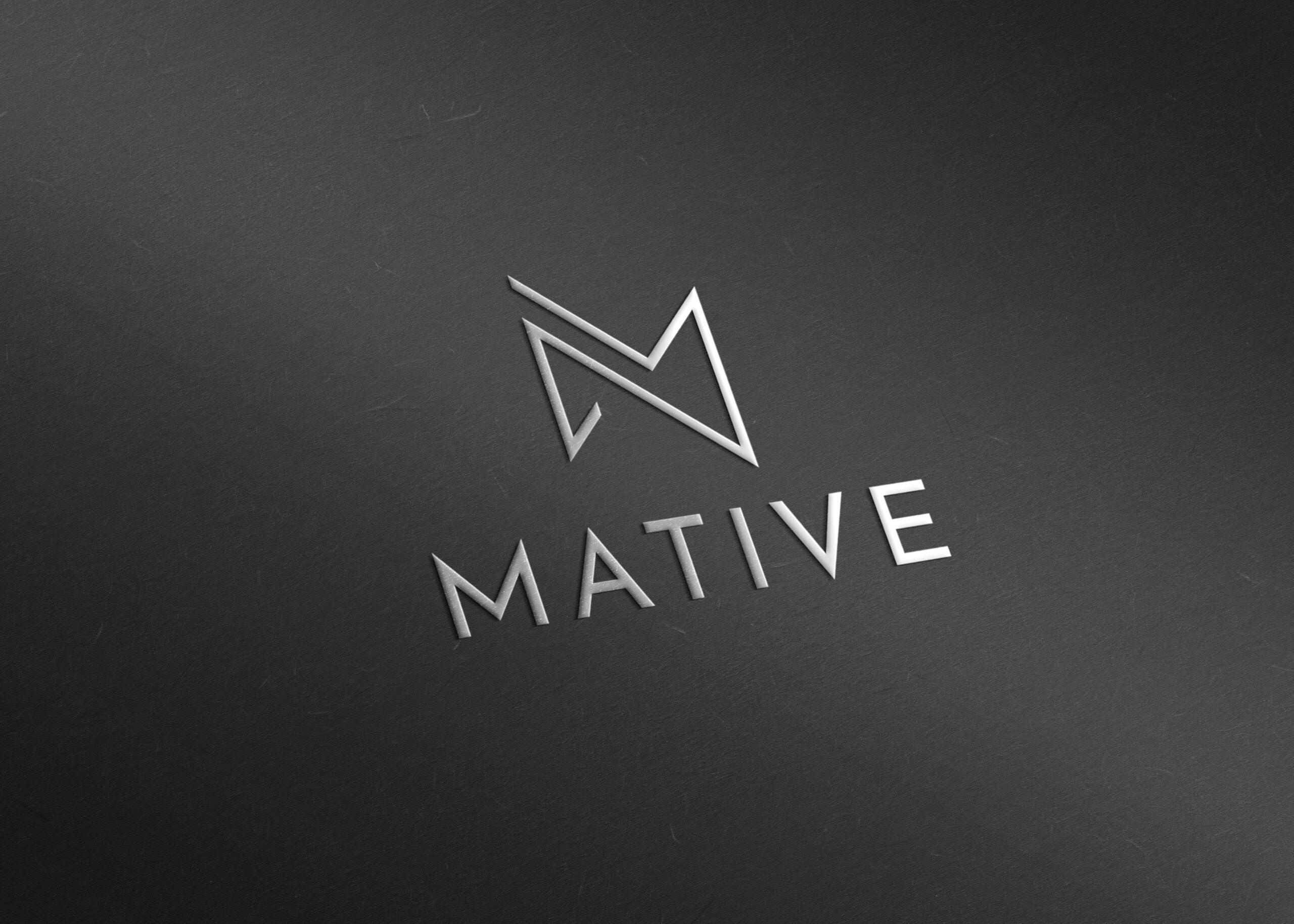
Logo Concept
We designed MATIVE‘s logo with continuous line forming the letter ‘M’, signifying the commitment to creative and efficient marketing. The design reflects precision and a streamlined approach. Paired with the ‘Josefina Sans’ font, it creates a modern, professional visual identity.


